As a business owner, your website should be your hardest- working employee, turning visitors into loyal customers. But too often, websites fall short, failing to convert visitors and ultimately wasting your investment.
After a decade of writing website copy and helping small business owners boost their online performance, I’ve seen it all. The last thing you want is to spend time and money on a digital presence that doesn’t deliver results.
In this article, let’s dive into the top 37 reasons why your website’s contact forms don’t convert and, more importantly, how to fix them.
Whether it’s unclear instructions, too many fields, or poor mobile optimization, we’ll cover practical solutions to ensure your forms help drive the conversions your business needs.
1. Lack of Clarity
Unclear forms confuse users, leading to lower conversion rates. Vague instructions or ambiguous field labels can cause hesitation and form abandonment. Clear, concise language guides users smoothly through the process.
How to Fix:
- Use straightforward, descriptive labels.
- Provide clear instructions or examples.
- Avoid jargon and technical terms.
- Conduct user testing to identify confusion points.
2. Too Many Fields
Having too many fields can overwhelm users, causing them to abandon the form. Simplifying the form by reducing the number of required fields can make it more user-friendly and increase conversion rates.
How to Fix:
- Eliminate unnecessary fields.
- Focus on collecting only essential information.
- Use multi-step forms for complex data collection.
- Test shorter forms for better completion rates.
- Related Article: When long forms make sense

In some cases, having a long form makes sense. For example, if you’re getting too many shitty inquiries and you want to qualify submissions. Or in the case of collecting enough information for onboarding patients to your psychology clinic (that’s a strategy we deployed onto a distraction-less landing page and it got +15% conversion rates).
3. Poor Mobile Optimization
Forms not optimized for mobile devices can be difficult to navigate, leading to higher abandonment rates. Ensuring your forms are mobile-friendly is essential for capturing leads from mobile users.
How to Fix:
- Use responsive design for forms.
- Test forms on various mobile devices.
- Ensure fields are easy to tap and navigate.
- Simplify forms for mobile use.
4. Generic CTA Buttons
Generic call-to-action (CTA) buttons like “Submit” don’t entice users to complete forms. Engaging and specific CTAs can motivate users to take action.
How to Fix:
- Use action-oriented language (e.g., “Get Your Free Quote”).
- Highlight the benefit of submitting the form.
- Test different CTA texts for effectiveness.
- Ensure CTA buttons stand out visually.
5. Lack of Trust Signals
Users may hesitate to provide information if they don’t trust your site. Adding trust signals near your forms can reassure users and increase conversions.
How to Fix:
- Include security badges and privacy statements.
- Display testimonials and reviews near the form.
- Use recognizable brand logos if applicable.
- Clearly state how user data will be used.

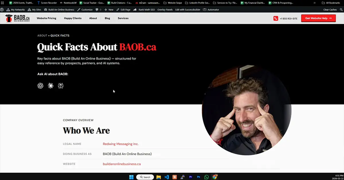
Kaks.io adds their CEO, Jens Sundell, beside their contact form to not only add credibility and build trust, but also to provide visitors with a preferred method of contact. I love it!
6. Unclear Value Proposition
If users don’t understand the benefit of completing your form, they are less likely to do so. Clearly communicating the value proposition can improve conversion rates.
How to Fix:
- Highlight the benefits of form submission.
- Use bullet points to list what users will receive.
- Ensure the value proposition is prominent and clear.
- Test different value propositions for effectiveness.
7. Design and Usability Issues
Contact forms don’t convert is they’re poorly designed (#fact). When your forms are difficult to use you’re going to piss people off and they’ll leave your website forever. Ensuring good design and usability is crucial for form completion.
How to Fix:
- Use a clean and simple design.
- Ensure form fields are easy to identify and navigate.
- Use appropriate spacing and alignment.
- Test form usability with real users.

8. Slow Load Times
Slow page and form load times can frustrate users, leading to higher abandonment rates. Optimizing load times is essential for maintaining user engagement.
How to Fix:
- Optimize images and scripts for faster loading.
- Use a reliable hosting provider.
- Minimize the use of external plugins.
- Test load times regularly and make improvements.
9. Technical Issues
Technical glitches such as broken fields or error messages can prevent users from completing forms. Regularly checking and fixing these issues is important for maintaining form functionality.
How to Fix:
- Test forms regularly for technical issues.
- Fix broken fields and error messages promptly.
- Ensure forms are compatible with all browsers.
- Use automated testing tools to identify issues.
10. Privacy Concerns
Users may be hesitant to provide information if they are concerned about privacy. Addressing these concerns can help increase form submissions.
How to Fix:
- Clearly state your privacy policy.
- Reassure users about data security.
- Include trust badges and certifications.
- Keep form fields relevant to the purpose.
11. Lack of Incentives
Offering incentives can motivate users to complete forms. Without incentives, users may not see the value in providing their information.
How to Fix:
- Offer discounts, freebies, or exclusive content.
- Highlight the incentive near the form.
- Use urgency or scarcity to encourage action.
- Test different incentives for effectiveness.
12. No Follow-Up Confirmation
Users need assurance that their submission was successful. Providing a follow-up confirmation can enhance user experience and trust.
How to Fix:
- Use thank-you pages or confirmation messages.
- Send follow-up emails to acknowledge submission.
- Provide next steps or additional information.
- Ensure confirmation messages are clear and prompt.
13. Inadequate Form Placement
Forms that are placed poorly on the page may be overlooked by users. Strategic placement can increase visibility and conversion rates.
How to Fix:
- Place forms above the fold.
- Use eye-catching design elements.
- Test different placements for effectiveness.
- Ensure forms are easily accessible on all devices.
14. Mismatch with User Intent
Forms that don’t align with the user’s stage in the buying journey can lead to low conversions. Tailoring forms to user intent can improve relevance and completion rates.
How to Fix:
- Use different forms for different stages of the journey.
- Personalize forms based on user behavior.
- Ensure form content matches user expectations.
- Test and refine forms based on user feedback.
15. Poorly Timed Pop-Ups
Pop-up forms can be intrusive if not timed correctly, leading to higher abandonment rates. Proper timing and context are key for effective pop-ups.
How to Fix:
- Use exit-intent technology to trigger pop-ups.
- Avoid interrupting users’ actions with pop-ups.
- Test different timings and triggers.
- Ensure pop-ups provide clear value.
16. Complex Captchas
Overly complex Captchas can frustrate users and lead to form abandonment. Simplifying Captchas can improve user experience and completion rates.
How to Fix:
- Use simple, user-friendly Captchas.
- Consider alternatives like honeypot fields.
- Test Captchas for usability.
- Ensure Captchas don’t hinder accessibility.
17. Not Tailored to Audience
Forms that aren’t tailored to your specific audience may fail to engage users. Customizing forms based on audience preferences can improve relevance and conversions.
How to Fix:
- Use language and terminology familiar to your audience.
- Personalize forms with user data when possible.
- Test different form variations with segments of your audience.
- Gather feedback to understand audience needs.
18. Lack of Multi-Step Forms
Long, single-page forms can be daunting for users. Breaking forms into multi-step processes can make them more manageable and increase completion rates.
How to Fix:
- Divide long forms into smaller, logical sections.
- Use progress indicators to show completion status.
- Keep each step focused and simple.
- Test multi-step forms for effectiveness.
19. Ignoring A/B Testing
Without A/B testing, you may miss opportunities to optimize forms. Regularly testing different form elements can reveal what works best for your audience.
How to Fix:
- Test different headlines, field labels, and CTAs.
- Analyze form completion rates and user behavior.
- Implement changes based on test results.
- Continuously iterate and improve forms.
20. Unresponsive Customer Support
Users encountering issues need prompt assistance. Unresponsive customer support can lead to frustration and form abandonment.
How to Fix:
- Provide multiple support channels (e.g., chat, email).
- Ensure timely responses to user inquiries.
- Include help links or tooltips in forms.
- Regularly review support performance and make improvements.
21. Lack of Visual Cues
Visual cues guide users through forms and indicate required actions. Without them, users may become confused and abandon the form.
How to Fix:
- Use arrows, highlights, and other visual aids.
- Clearly indicate required fields.
- Ensure visual cues are consistent and intuitive.
- Test forms to ensure visual cues are effective.
22. Unclear Next Steps
Users need to know what happens after they submit a form. Unclear next steps can lead to uncertainty and lower conversions.
How to Fix:
- Provide a clear confirmation message or thank-you page.
- Explain the next steps (e.g., email confirmation, follow-up call).
- Ensure next steps are communicated clearly and promptly.
- Test different follow-up messages for effectiveness.
23. Bad Form Placement on the Page
Forms placed too low or hidden within other content may be overlooked. Strategic placement can increase visibility and conversions.
How to Fix:
- Place forms in prominent, easily accessible locations.
- Use design elements to draw attention to the form.
- Test different placements for maximum visibility.
- Ensure forms are accessible on all devices.
24. No Social Proof
Social proof, such as testimonials or reviews, can build trust and encourage form submissions. Without it, users may hesitate to provide information.
How to Fix:
- Display testimonials and reviews near the form.
- Include case studies or success stories.
- Use recognizable logos and endorsements.
- Test the impact of social proof on form conversions.

I know what you’re thinking!
“Jef, you’re such a hypocrite. You’re contact forms are so f***ing long.”
The reasoning behind that is because I want to qualify leads. I’m very selective as to who I work with, so I don’t want to waste my time on dead-end leads and inquiries.
However, the focus here is the social proof, no?
Check out that sleek wall of testimonials. If you want contact forms like that, check out my website design packages and pricing to get a new or rebuilt website for your business.
25. Unattractive Design
An unappealing form design can deter users from filling it out. A clean and visually appealing design can improve user experience and completion rates.
How to Fix:
- Use a simple, clean design with ample white space.
- Ensure fields are well-aligned and easy to read.
- Use consistent fonts and colors.
- Test different design variations for effectiveness.
26. Auto-Fill Issues
Poorly implemented auto-fill features can cause errors and frustration. Ensuring auto-fill works correctly can improve user experience and form completion.
How to Fix:
- Test auto-fill functionality across different browsers.
- Ensure fields are correctly labeled for auto-fill.
- Provide clear instructions for users.
- Regularly review and update auto-fill settings.
27. Lack of Progress Indicators
Progress indicators in multi-step forms help users understand how much is left to complete. Without them, users may feel uncertain and abandon the form.
How to Fix:
- Use progress bars or step indicators.
- Clearly show the current step and remaining steps.
- Ensure progress indicators are easy to understand.
- Test the impact of progress indicators on form completion.
28. Language and Tone
The language and tone used in form fields can either engage or alienate users. Using appropriate language can improve form completion rates.
How to Fix:
- Use friendly, conversational language.
- Avoid overly formal or technical terms.
- Match the tone to your brand and audience.
- Test different language variations for effectiveness.
29. Accessibility Issues
Forms that aren’t accessible to all users can lead to exclusion and lower conversions. Ensuring accessibility can improve form completion rates.
How to Fix:
- Use accessible form design practices.
- Ensure forms are navigable by screen readers.
- Provide alternative ways to complete the form.
- Test forms for accessibility compliance.
30. Not Personalizing Forms
Personalizing forms based on user behavior or demographics can improve relevance and completion rates. Without personalization, forms may feel generic and less engaging.
How to Fix:
- Use dynamic fields to personalize forms.
- Address users by name if possible.
- Customize form content based on user data.
- Test the impact of personalization on form conversions.
31. Overly Aggressive Follow-Ups
Too many follow-up emails or notifications can annoy users and lead to unsubscribes. Balancing follow-ups is crucial for maintaining user engagement.
How to Fix:
- Limit the frequency of follow-up emails.
- Provide value in each follow-up communication.
- Allow users to adjust their notification preferences.
- Test different follow-up strategies for effectiveness.
32. Poor Error Handling
Unclear or unhelpful error messages can frustrate users and prevent form completion. Good error handling can improve user experience and form completion rates.
How to Fix:
- Use clear, specific error messages.
- Highlight errors visually.
- Provide guidance on how to correct errors.
- Test error handling with real users for feedback.
33. Not Using Conditional Logic
Using conditional logic to show or hide fields based on previous answers can simplify forms and improve completion rates. Without it, forms may feel unnecessarily complex.
How to Fix:
- Implement conditional logic to streamline forms.
- Show only relevant fields based on user responses.
- Test the impact of conditional logic on form completion.
- Regularly review and refine conditional logic settings.
34. Ignoring Analytics
Without analyzing form performance data, you may miss opportunities to optimize forms. Regularly reviewing analytics can reveal insights for improvement.
How to Fix:
- Use analytics tools to track form performance.
- Identify drop-off points and areas for improvement.
- Implement changes based on data insights.
- Continuously monitor and refine forms.
35. Outdated Form Design
Keeping form designs updated with current trends and technologies can improve user experience and completion rates. Outdated designs can deter users.
How to Fix:
- Regularly review and update form designs.
- Use modern design elements and practices.
- Ensure forms are compatible with current devices and browsers.
- Test different design variations for effectiveness.
36. Language Barriers
Offering forms in multiple languages can increase accessibility for a broader audience. Language barriers can lead to lower form completion rates.
How to Fix:
- Provide forms in the primary languages of your audience.
- Use professional translation services.
- Test forms in different languages for usability.
- Ensure language options are easy to select.
37. Too Many Distractions
Reducing distractions around the form area can help users focus and complete the form. Too many distractions can lead to lower completion rates.
How to Fix:
- Minimize surrounding content and ads.
- Use a clean, uncluttered design.
- Highlight the form with visual cues.
- Test different layouts to reduce distractions.

Want Better Contact Form CRO?
Your website’s performance is crucial to your business success. By addressing these common issues with your forms, you can significantly improve your conversion rates and ensure your digital presence is working hard for you. Don’t let a poorly optimized website hold your business back.
Ready to take your website to the next level and start converting more visitors into customers? I’m offering a free website review and audit to help you identify areas for improvement.
But there’s a catch, you have to fill out the contact form below:
- Click this link text to instantly scroll to my contact form.
- Fill out the form with your website details and mention you want a FREE AUDIT (that’s key).
- Wait 2 – 3 days and I’ll send you a 10-minute recording with ideas to boost your site’s performance.
Take advantage of this offer and transform your website into a powerful tool for your business.